So, you’ve decided to start a membership site, or even to add a member’s area to your existing site. You’ve even chosen your membership website builder, but now you need some inspiration…
How exactly should your membership site look?
Reviewing some of the best membership site design examples is an important step in figuring out what works and how to successfully grow your membership business.
In this article, we’ve put together some great membership websites that are popular with good UX that you should check out.
Best Membership Site Design Examples
MasterClass
MasterClass is a well-known membership platform offering high-quality video courses taught by experts like Gordon Ramsay. Members get unlimited access to ‘bite-sized’ lessons that cover various subjects from writing to cooking, developing your career, or improving your lifestyle.
The homepage is clean, featuring a strong call-to-action (CTA) to join or explore classes. Navigation is intuitive, and the docu-style visual production provides unique, first-person instruction.
Net Net Hunter
Net Net Hunter is an investment membership platform designed for value investors, specifically those interested in Benjamin Graham’s high performing ‘net-net’ stock strategy. The platform offers tools like stock shortlists that have been well researched based on Graham’s principles.
Members also get access to a resource center and an exclusive members-only forum for discussing investment strategies. Net Net Hunter’s success is down to their excellent research with a focus on undervalued stocks which provide excellent returns for long-term investors.
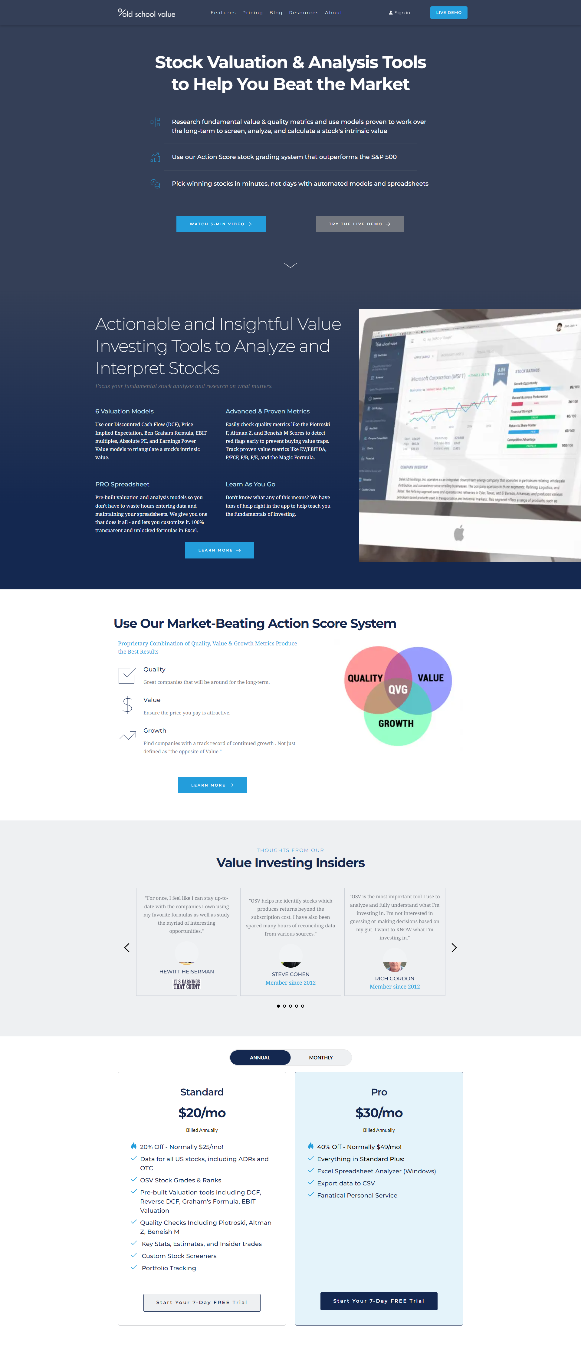
Old School Value
OldSchoolValue.com is another investment platform designed to help individual investors evaluate stocks through its stock-value analysis software. It provides tools, research, and pre-built valuation models to help users make informed decisions based on financial data and stock ratings.
The site offers Standard and Pro memberships that include detailed stock reports and portfolio tracking tools. OldSchoolValue.com aims to simplify complex financial data, making it accessible to both novice and experienced investors looking for long-term value investments.
Mindvalley
Mindvalley claims to be the world’s ‘“most powerful life transformation platform” and focuses on personal growth and development. The design of Mindvalley is highly visual and uses dynamic videos and interactive elements that create an engaging experience.
The platform is structured to guide users through the courses easily, with clear navigation and well-organized content sections. Mindvalley also encourages the use of progress trackers, which motivates members to complete courses and remain subscribed.
Food Blogger Pro
Food Blogger Pro is a membership platform designed to help aspiring food bloggers build, grow, and monetize their blogs. It offers a range of resources, including tutorials on photography, SEO, video editing, and social media strategies.
Members gain access to a supportive community forum, expert Q&A sessions, and exclusive tools like traffic trackers and content creation templates. The site’s user-friendly design and clear structure make it easy for users to navigate and find valuable information tailored to food blogging success.
These examples show how thoughtful design can significantly enhance the value of a membership site. We hope you found some inspiration.


